
Next.js is surely one of the most beloved ways of building applications with React & typescript. It offers convenient routing capabilities, optimizes lots of processes under the hood, and offers great developer experience.
Paired with other modern tools like tRPC it brings a shipping fast mentality across the whole stack and allows you to evolve your application at a super-fast pace without risks of breaking something(thanks typescript).
Tailwind CSS is another modern standard when it comes to web development. It brings the same level of speed & joy to styling the web applications as the above technologies do for full-stack development.
When developing frontend with Next.js we are often finding ourselves adding more and more components to use in our apps. Similarly, as Next.js is a standard for frontend applications, Tailwind is a standard for styling, - Storybook is a modern standard for documenting and testing components.
Let’s see how we can marry the three together and integrate Storybook with Next.js and Tailwind CSS.
Next.js and Tailwind setup
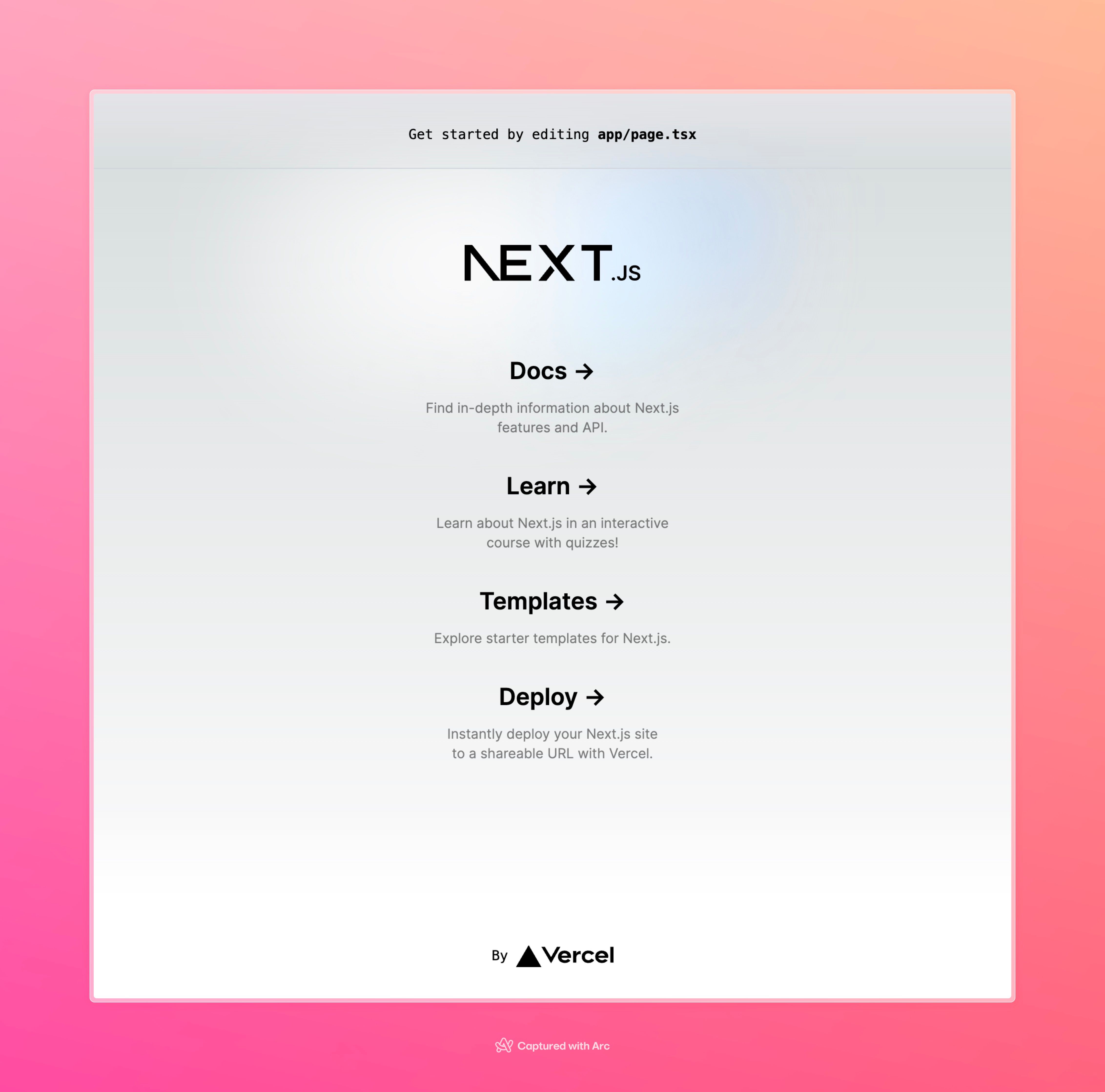
To start we will bootstrap a simple boilerplate of Next with Tailwind included.
npx create-next-app@latest
We choose default options for most of the steps of the Next.js project creation wizard:
✔ What is your project named? … storybook-next
✔ Would you like to use TypeScript? … Yes
✔ Would you like to use ESLint? …  Yes
✔ Would you like to use Tailwind CSS? …  Yes
✔ Would you like to use `src/` directory? … No
✔ Would you like to use App Router? (recommended) …  Yes
✔ Would you like to customize the default import alias (@/*)? … No
✔ What import alias would you like configured? … @/*
After running npm run dev our Next.js app shall be running, Tailwind styles are already applied!
Add Storybook to Next.js project
Let’s add Storybook with the following command:
npx storybook init
This will run our Storybook immediately and you will see some exemplary components already created for us in the template.
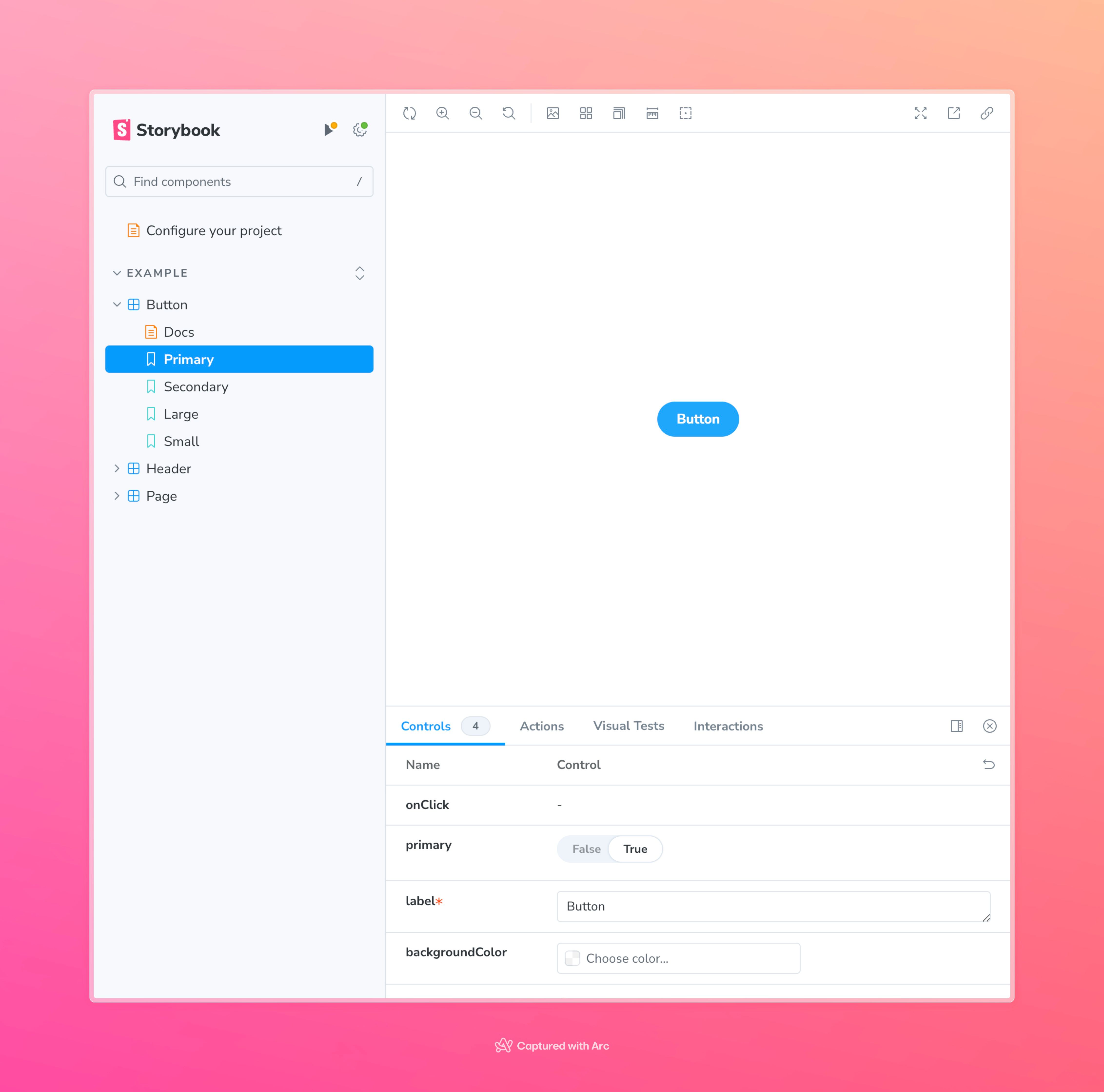
We will remove all of the generated components except the Button and extend our Storybook with our own components in the next step.
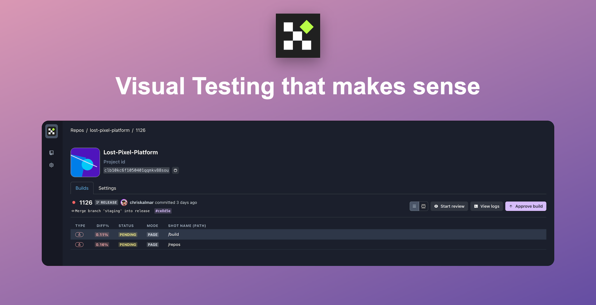
Set up visual regression tests in minutes with Lost Pixel Platform. Do not let your users find bugs first.
Build a simple component with Storybook
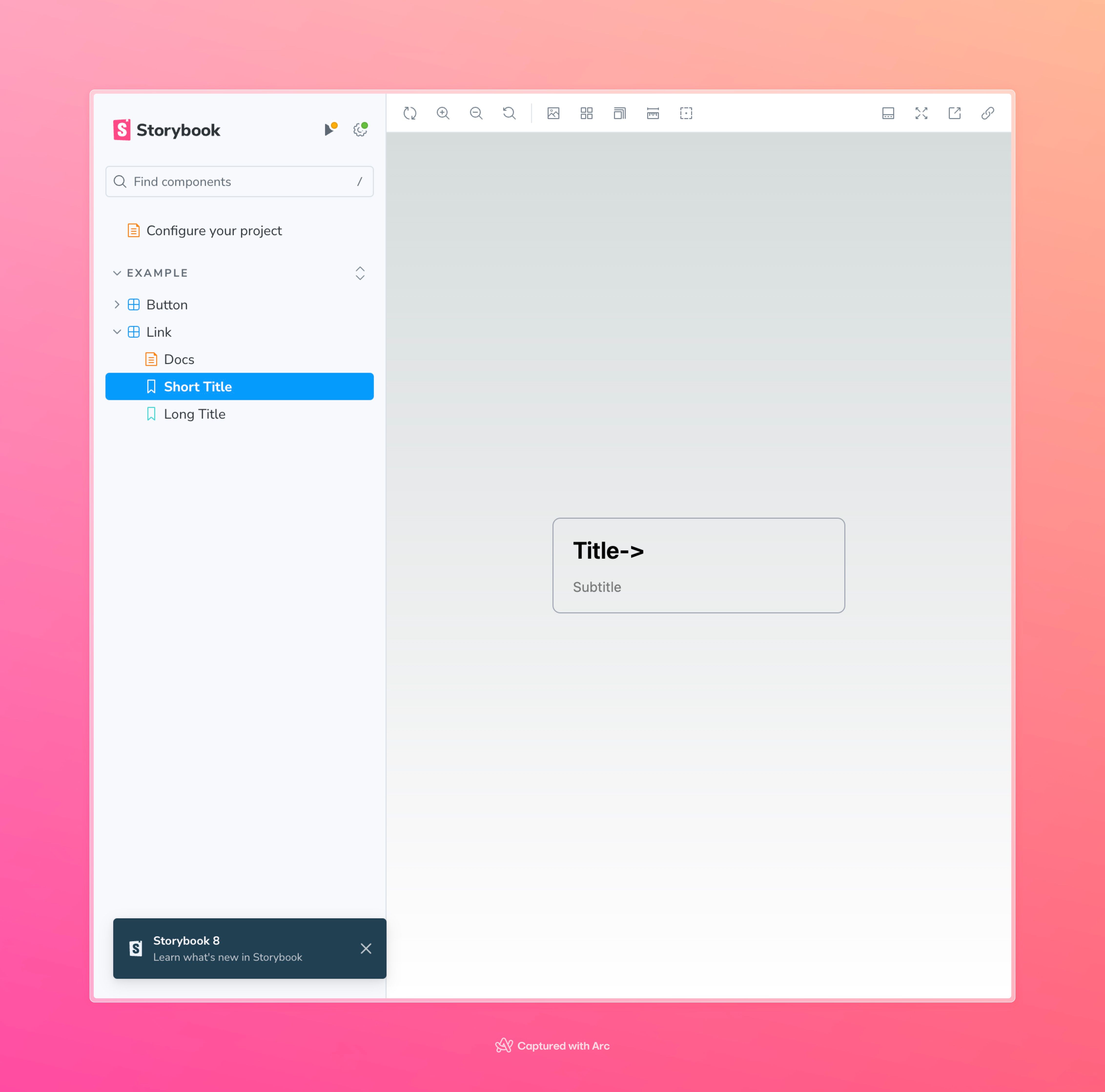
Let’s assume we build our application from the ground up and want to add some basic components to reuse later. Let’s move out the Link to a separate component so we can reuse it!

Let’s create our new component in the app/components/link.tsx
import React from "react";
const Link = ({
ahref,
title,
subtitle,
}: {
ahref: string;
title: string;
subtitle: string;
}) => {
return (
<a
href={ahref}
className="group rounded-lg border border-transparent px-5 py-4 transition-colors hover:border-gray-300 hover:bg-gray-100 hover:dark:border-neutral-700 hover:dark:bg-neutral-800/30"
target="_blank"
rel="noopener noreferrer"
>
<h2 className={`mb-3 text-2xl font-semibold`}>
{title}
<span className="inline-block transition-transform group-hover:translate-x-1 motion-reduce:transform-none">
->
</span>
</h2>
<p className={`m-0 max-w-[30ch] text-sm opacity-50 text-balance`}>
{subtitle}
</p>
</a>
);
};
export default Link;
To add this newly created component to our Storybook we need to create a story file in stories/Link.stories.ts:
import Link from "../app/components/link";
import type { Meta, StoryObj } from "@storybook/react";
// More on how to set up stories at: https://storybook.js.org/docs/writing-stories#default-export
const meta = {
title: "Example/Link",
component: Link,
parameters: {
// Optional parameter to center the component in the Canvas. More info: https://storybook.js.org/docs/configure/story-layout
layout: "centered",
},
// This component will have an automatically generated Autodocs entry: https://storybook.js.org/docs/writing-docs/autodocs
tags: ["autodocs"],
// More on argTypes: https://storybook.js.org/docs/api/argtypes
argTypes: {
title: { control: "text" },
subtitle: { control: "text" },
ahref: { control: "text" },
},
} satisfies Meta<typeof Link>;
export default meta;
type Story = StoryObj<typeof meta>;
// More on writing stories with args: https://storybook.js.org/docs/writing-stories/args
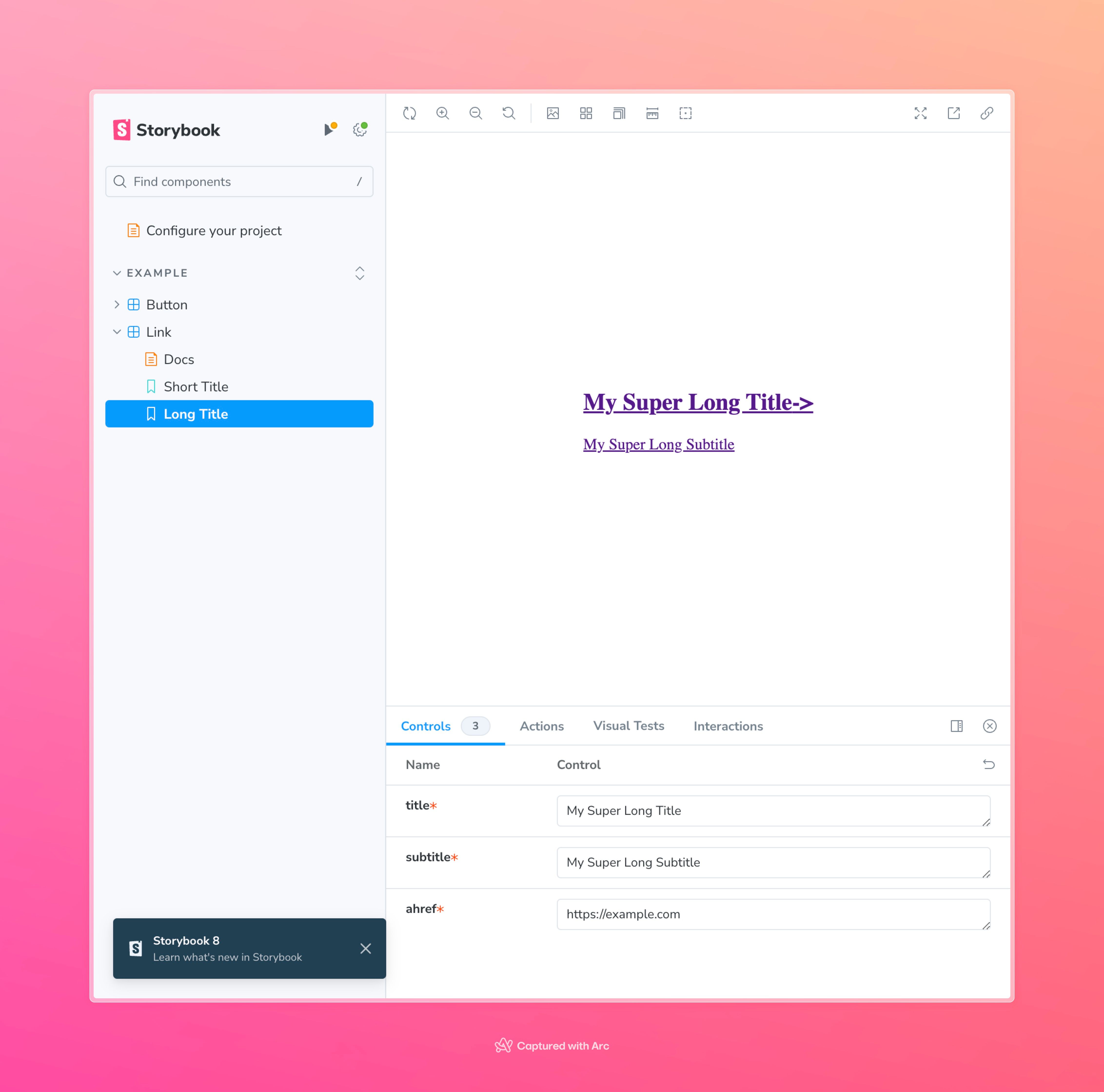
export const ShortTitle: Story = {
args: {
title: "Title",
subtitle: "Subtitle",
ahref: "https://example.com",
},
};
export const LongTitle: Story = {
args: {
title: "My Super Long Title",
subtitle: "My Super Long Subtitle",
ahref: "https://example.com",
},
};
We create two stories with different arguments, to document two versions of our Link component. This is just scratching the surface but this would already be of great help in developing this component and its variations.
There is one problem though, if you look at this component in the Storybook UI you will see that it is missing styles.
Fixing Tailwind styles missing in Storybook
The fix is rather fast here, we just need to import Tailwind styles into Storybook. In .storybook/preview.ts add the import at the top, it should look like this:
import type { Preview } from "@storybook/react";
import "../app/globals.css";

const preview: Preview = {
  parameters: {
    controls: {
      matchers: {
        color: /(background|color)$/i,
        date: /Date$/i,
      },
    },
  },
};

export default preview;
What’s next
This setup allows you to quickly build your components in isolation instead of starting the whole application every time you need to work on them specifically.
Storybook also serves as the documentation of your components and allows for quicker onboarding for the new teammates when it comes to working with those components.
Visual regression testing
Storybook and Next.js setup also allow for adding simple yet powerful visual testing to your application without any additional overhead.
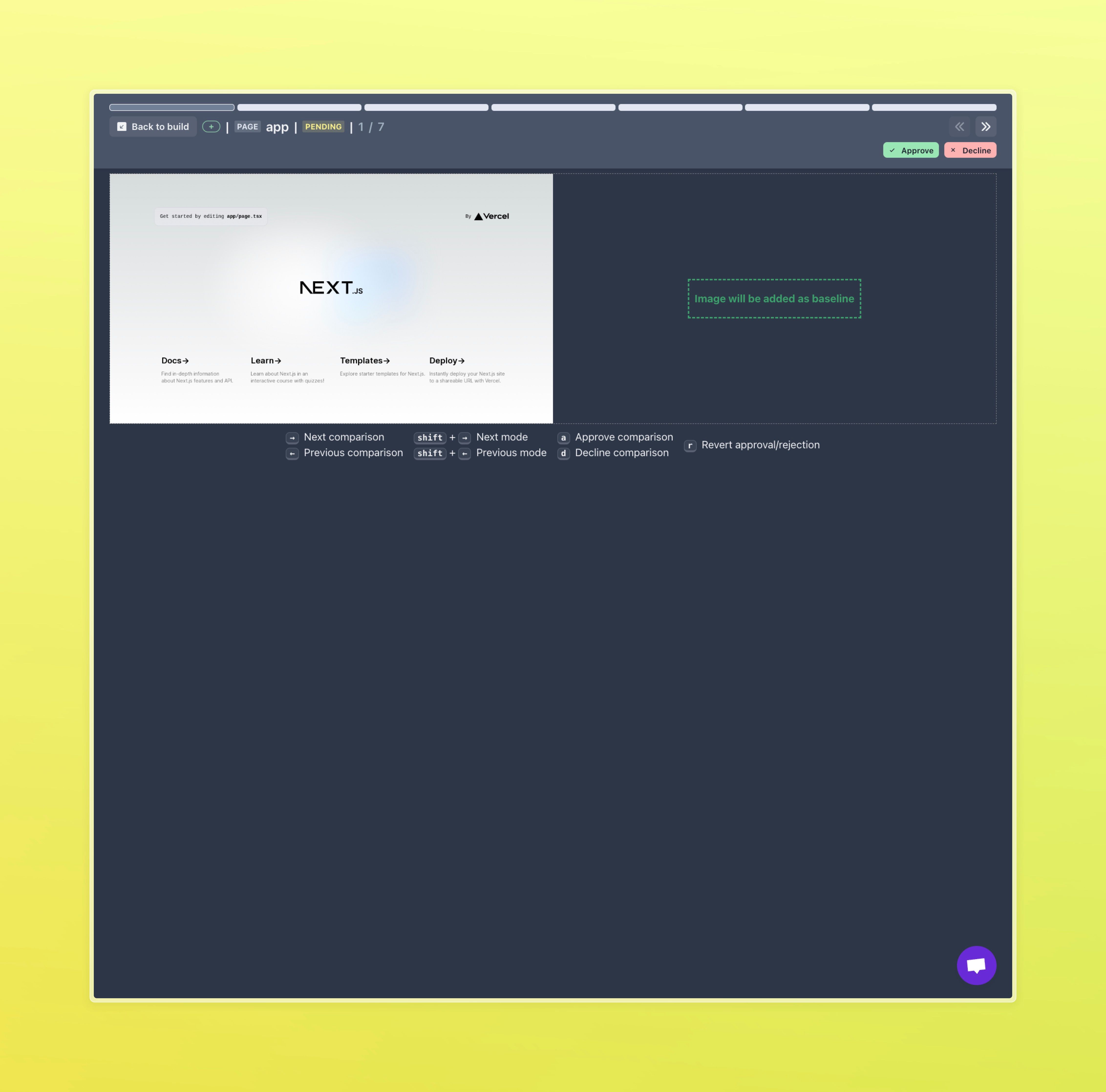
Having Next.js and Storybook you can add frontend tests to your GitHub repo in less than 5 minutes with Lost Pixel. Lost Pixel is an open-source visual regression testing alternative to Percy & Chromatic - check the repo here.
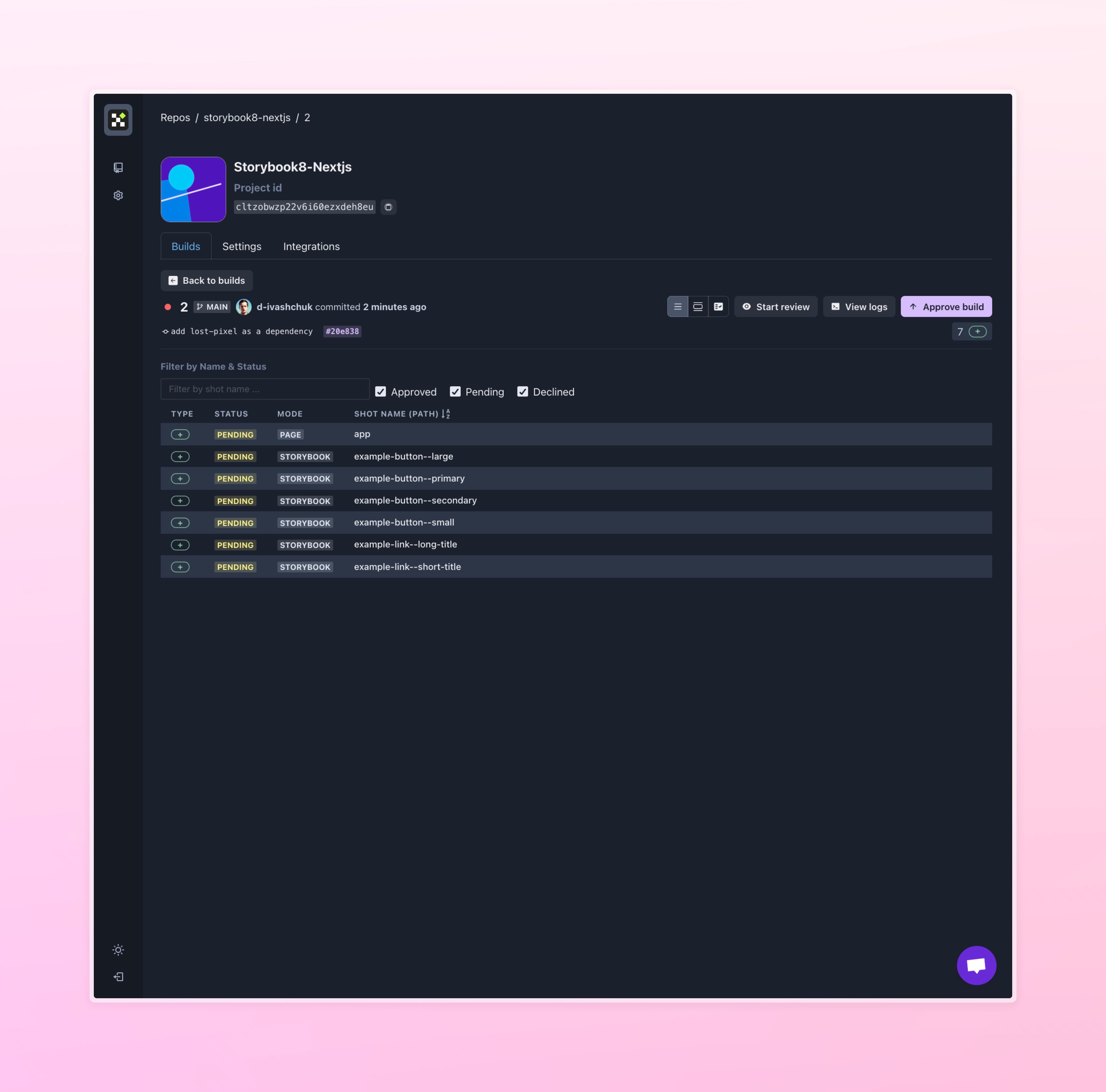
With Lost Pixel Platform you can visually see how changes in your code reflect on your frontend and collaboratively review the images in the simple-to-use UI

About Dima Ivashchuk
Hey, I'm - Dima the co-founder of Lost Pixel. I like modern frontends, building stuff on the internet, and educating others. I am committed to building the best open-source visual regression testing platform!