According to a G2 report, more than 73% of visitors leave a website if the website is not responsive.
Users expect websites to adapt effortlessly to their chosen platform, from smartphones and tablets to laptops and desktops.
In this article, you will learn:
- Basics of responsive design so you can easily give feedback to developers as QA engineers.
- The importance of responsive design testing so you know why to put time to save time later.
- A responsive design testing checklist so you can reference it anytime to save your time.
- Tools for testing responsive design so you can easily automate manual boring tasks.
Let's get started.
What is Responsive Design?
Responsive design is a web design technique that allows a website to adjust its layout and visual style to any device and screen size.
It makes a website usable and functional on all devices, such as desktops, laptops, and mobile devices.
Instead of building separate versions of the same website, responsive design uses fluid layouts and media queries to adapt the same HTML and CSS code to various devices with different viewport dimensions.
Principles of Responsive Web Design
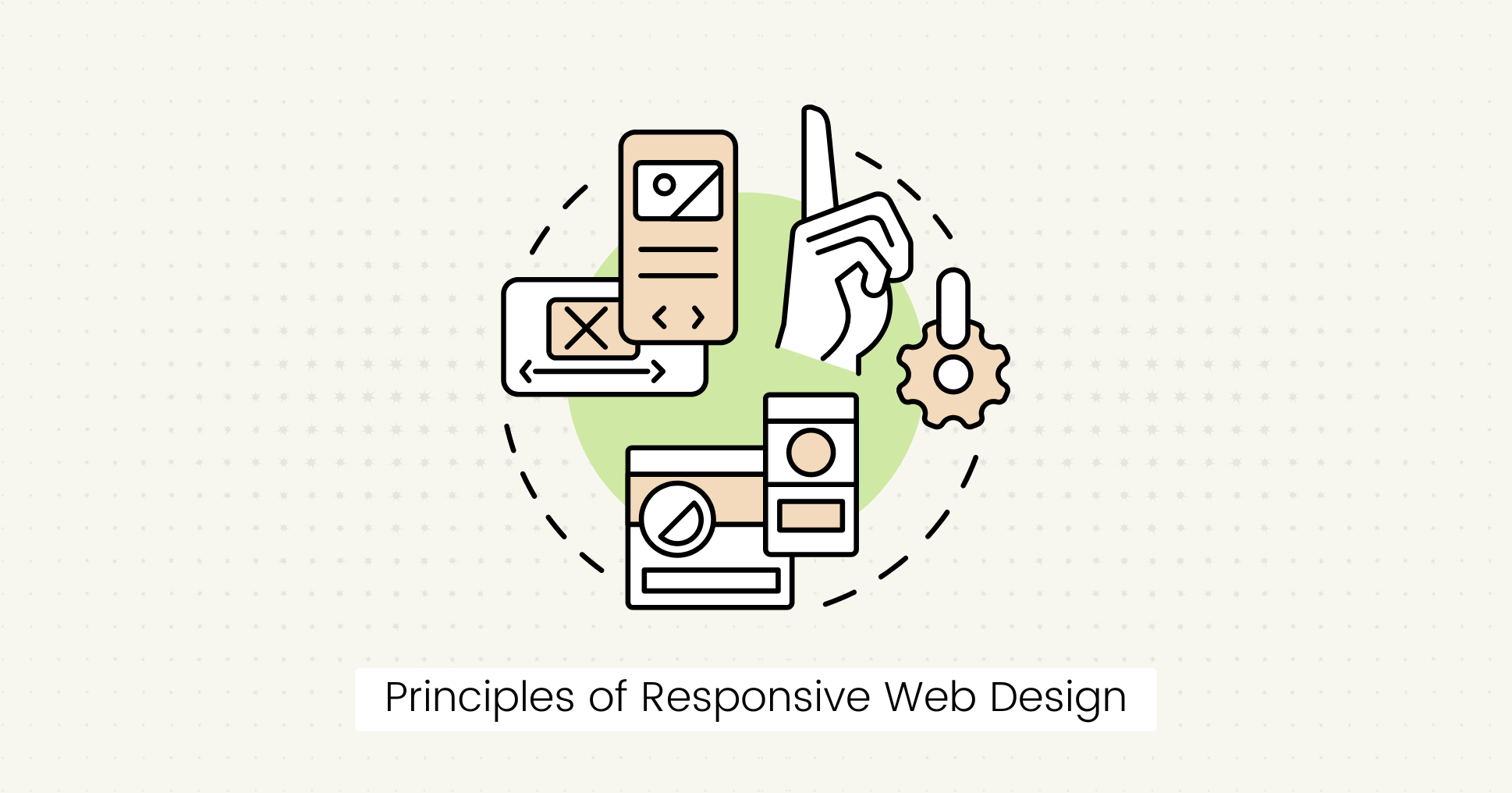 The basic principles of a responsive website design are as follows:
Fluid Layouts
Create a fluid layout so the webpage adapts to the current viewport width.
It allows the layout resized according to different screen sizes while maintaining content readability.
Unlike fixed-width layouts, fluid layouts use responsive units to easily scale the entire layout down or up.
- Use relative units like percentages and rem instead of px for most lengths.
- Use max-width instead of width.
- Use position: relative to place an element on the screen based on its relationship to another element instead of fixing it in a certain place.
Media Queries
With media queries, you can apply CSS styles based on the characteristics of the user's device, such as screen size and resolution.
Media queries allow websites to dynamically adapt their layout and content to fit different screen sizes by specifying breakpoints (viewport widths).
Flexible Images
By default, images do not scale when we change the viewport size.
Responsive web design incorporates flexible images for varying screen resolutions and aspect ratios.
- Use % for image dimensions and max-width property to make images scale proportionally without overflowing their containers or losing clarity.
- For example, set the max-width to 100% and use img
{ max-width: 100%; height: auto; }in CSS to make images flexible and responsive.
Why is Responsive Design Testing Important?
Responsive design is important to provide an intuitive and enjoyable user experience across all devices and platforms.
Here are some key points why responsive design testing is important:
- It allows you to verify that your website functions correctly on multiple devices without lagging and is accessible to all users.
- You can provide a consistent user experience across different screen sizes and resolutions.
- It helps you maintain a professional brand image, as websites that look or function inconsistently on different devices leave a poor impression on users.
- A responsive website helps you save time and money by fixing potential design issues early in development.
Responsive Design Testing Checklist
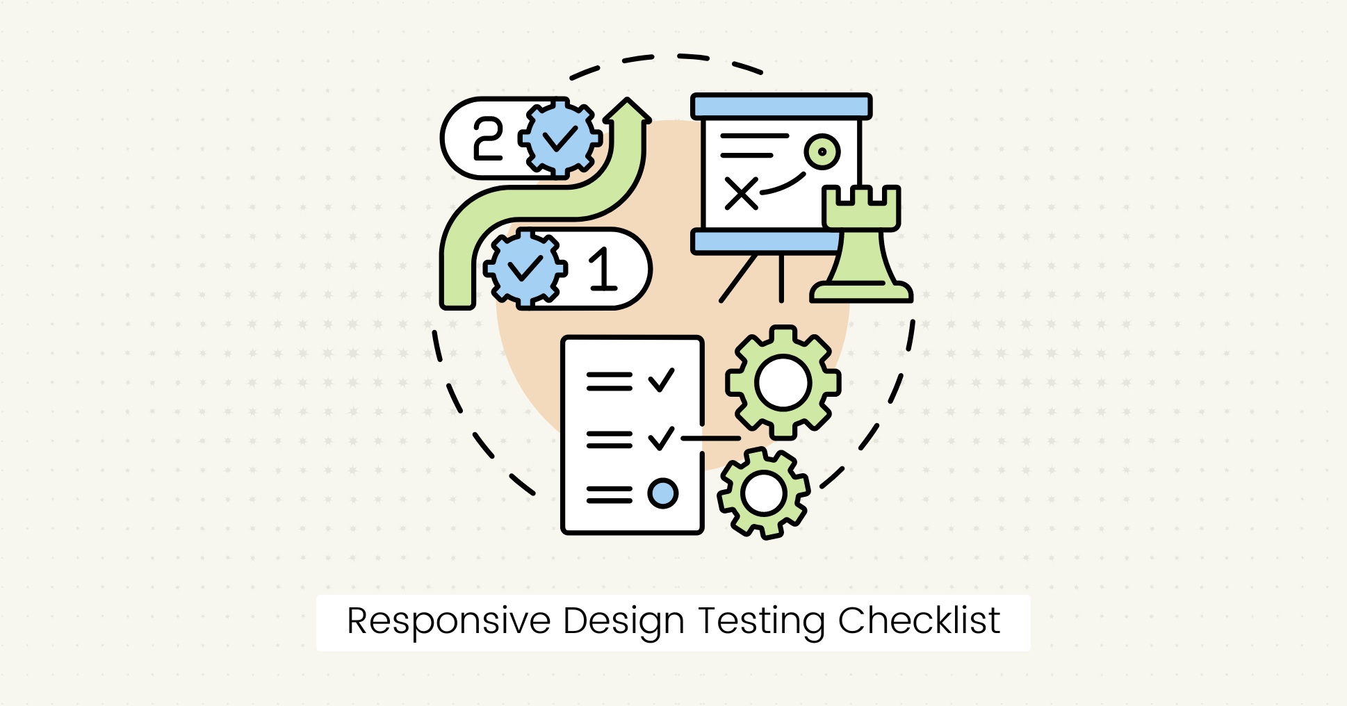 Testing responsive design to identify and resolve layout, functionality, and performance issues is an important step in web development.
Here's a checklist to help you test your responsive website:
Cross Browser Compatibility
Cross-browser testing is an important step in determining web application responsiveness. It verifies whether the website is cross-browser compatible.
Examples:
- Test your website across popular web browsers for compatibility issues.
- Test compatibility with older browser versions.
- Check for browser-specific traits and inconsistencies that may affect layout and functionality.
Test for Mobile Devices
Testing the responsiveness for small screen sizes is important because over 65% of internet traffic comes from mobile devices (SimilarWeb).
With the growing number of mobile users, it is necessary to consider the mobile-first design approach while creating a responsive website.
You can start writing code for small screen sizes and then use media queries to expand the design to a larger screen.
Examples:
- Test on both iOS and Android devices to accommodate all users.
- Use emulators/simulators for real device testing.
Performance
Evaluate the performance of your responsive website for a smooth user experience.
To optimize performance, you can conduct responsive website testing to check the website's speed, responsiveness, and stability under different conditions.
- Test page load times and performance metrics like interactive experience, mobile browser responsiveness, and resource utilization.
- Check images, scripts, and other media elements to reduce load times, especially on mobile devices with slower network connections.
Layout and Content
Check the responsiveness of your website to maintain UI consistency in design across different devices and screen sizes.
- Check for issues such as content overlapping and misaligned text.
- Test that text, images, buttons, and navigation menus are properly positioned and visible on all devices.
- Set font size, spacing, and alignment to improve readability.
Functionality
Test the functionality and usability of your website to make it responsive to different devices.
- Test interactive features such as buttons, links, forms, and dropdown menus on various screen sizes.
- Verify that interactive elements are easily accessible and responsive to touch gestures on touchscreen devices.
- Check form submissions, error messages, and user feedback mechanisms.
- Conduct end-to-end user interface testing, such as registration, login and account management.
Tools for Testing Responsive Design
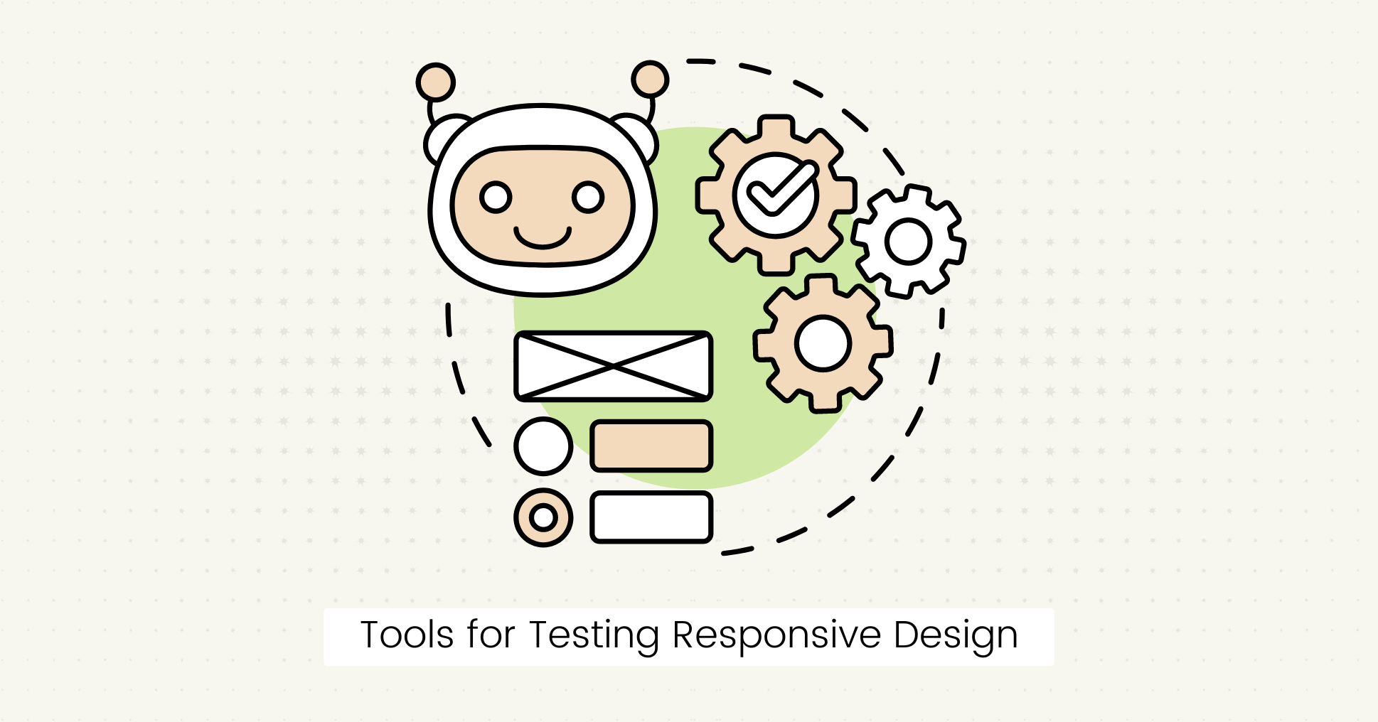 Several tools are available to test your website's responsiveness on various browsers, devices, and OS.
With automated responsiveness testing tools, you can easily cover the comprehensive, responsive design checklist without any manual effort and save time and resources.
Here are some tools for testing responsive websites on different devices:
Lost Pixel
It is an open-source visual regression testing tool that allows you to visually test UI components in minutes.
With this tool, you can automate the detection of unintended visual changes between different website versions.
The visual regression test consists of three parts:
- Screenshot of the element before code change (baseline image).
- Screenshot of the same element after a code change.
- Generate different images in case of visual regressions.
There are several advantages of visual regression testing, such as:
- Accuracy: By comparing screenshots pixel by pixel, visual regression testing can identify even the slightest changes that might go unnoticed during manual testing.
- Comprehensive Coverage: You can test your website's responsiveness across various devices, screen sizes, and browsers to provide a consistent user experience.
- Early Detection: You can detect regressions early in the development cycle and catch visual bugs before your users.
Chrome DevTools
Chrome DevTools offers powerful features for testing and debugging responsive designs.
This tool allows you to simulate various devices and screen sizes to see how the layout and element styles adapt to different viewports.
You can monitor performance metrics to find and fix errors and view real-time changes.
Hoverify
Hoverify is an all-in-one Chrome browser extension that previews any site on multiple screen sizes side-by-side.
It offers tools to inspect and debug code for a smooth development experience.
Tip: You can also read our recent guide about cross-browser testing tools to automate your entire process of responsive design testing.
Final Words
Responsive web design is more than just a design trend; it's an important part of the QA testing checklist for creating user-friendly and accessible websites.
By using responsive design testing tools, you can address potential layout, functionality, and performance issues to make your website responsive to all devices and screen sizes.
FAQs
What is the difference between cross-browser testing and responsive testing?
Cross-browser testing ensures compatibility across different web browsers, while responsive testing ensures that a website displays correctly across various devices and screen sizes.
Why should you automate your responsive design testing?
Automating responsive design testing saves time and increases efficiency across devices and browsers.

About Dima Ivashchuk
Hey, I'm - Dima the co-founder of Lost Pixel. I like modern frontends, building stuff on the internet, and educating others. I am committed to building the best open-source visual regression testing platform!